
Ok, so it isn’t the final countdown but it is the final challenge for level one of my AECP. For those that don’t know what I am talking about, AECP is the Altenew Educator Certification Program. Level one consists of 10 different classes that must be completed and the assignments must be accepted by the coordinator before you can start the challenge.
The Challenge
The challenge? Create 2 gift sets of 4-6 cards each, one masculine, one feminine using techniques taught in the level one courses. I was supposed to choose 3, but I ended up using a lot of different techniques from many of the 10 classes.
The sets needed be cohesive but not the same of course. I also had to create packaging for each set. The final part of the challenge was to recycle something in some way for either the cards or the packaging. Here we go!
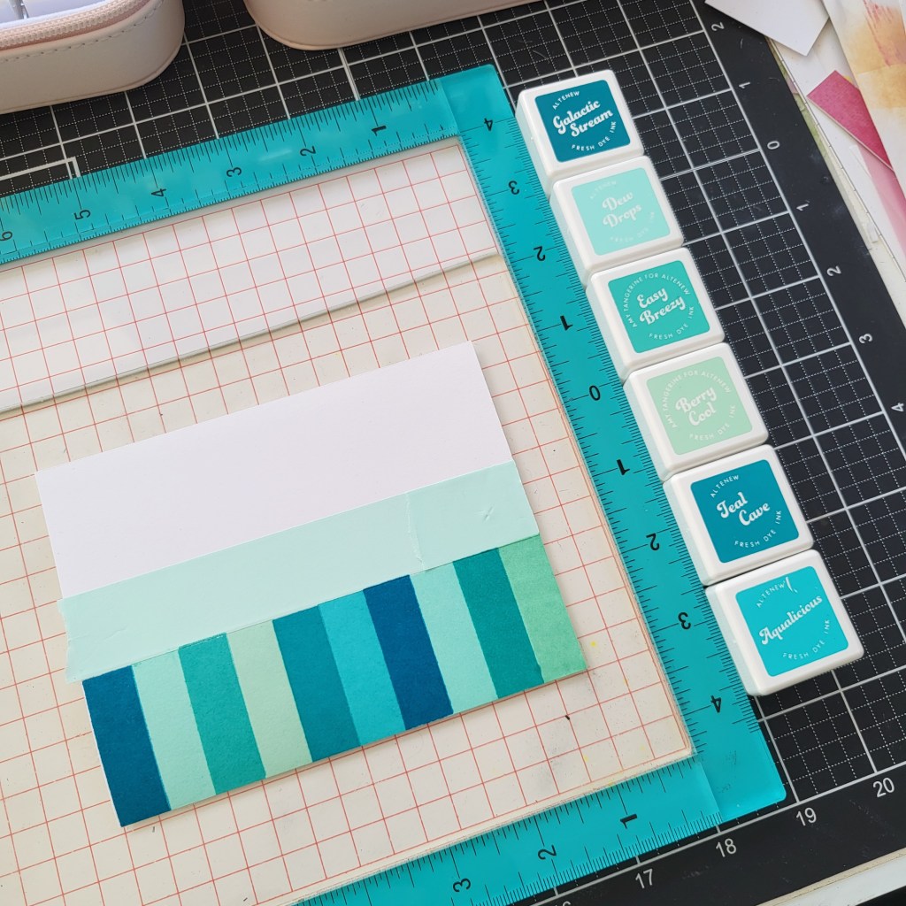
Before I started on either set, I needed to choose some elements that I was going to use on both sets. I opted to go with a aqua/teal palette for both sets. The colours would be the cohesive factor between the 2 sets. Here are the colours I chose. All of them are Altenew Fresh Inks. Berry Cool, Dew Drops, Easy Breezy, Aqualicious, Teal Cave and Galactic Stream.

Once I had the colours down, I had to decide what “theme” I would go with for the masculine set. I thought back to the “For the Guys” class and decided to use geometric elements as my main focus. I pulled out my Altenew “Building Blocks” stamp set and got to work.

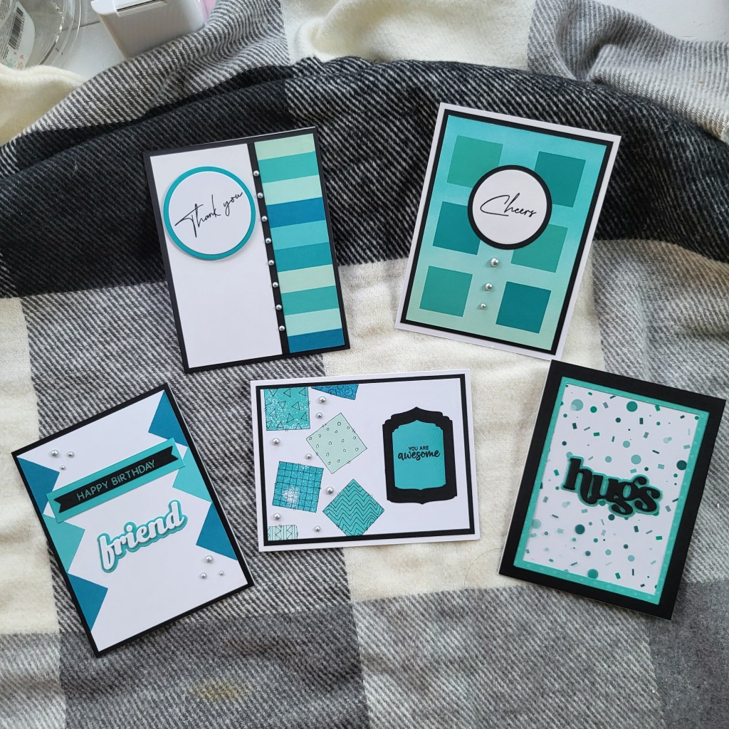
Masculine Cards
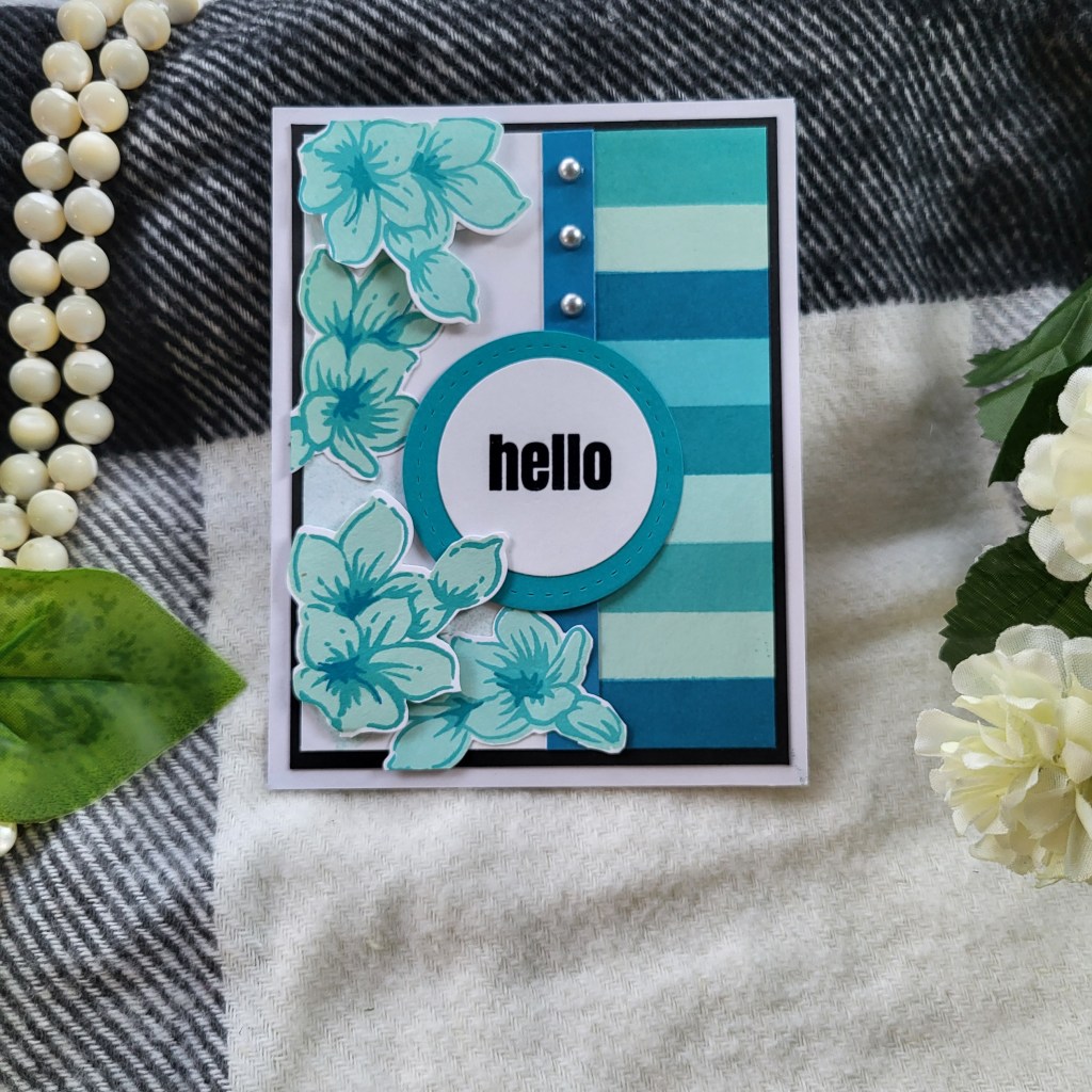
Here are all the completed cards for the masculine set.
The first card in the set, I had a vision of a keyboard type of design down one side so I grabbed one of the rectangles and masked off the left side of the card and stamped the rectangles in some of my chosen palette.


I used my stamping platform because I wanted nice solid coverage and I find the Fresh Inks need multiple stamps to get that level of coverage. There was no way I was going to be able to freehand that. It also helped line up the various colours so much better than I would have been able to by hand.
I decided that all my cards would have some kind of black accent on them, and for this card, I chose a small strip of black to separate the white from the colours.
Now it was time for the sentiment. I chose to make this one a thank you card and grabbed my Elegant Sayings set. I cut out a couple of circles and stamped the sentiment on the smaller white one with Versafine Clair Nocturne. I then heat embossed it with clear embossing powder and popped it up with foam tape on the left side.

For a little “bling”, I added the brushed silver half pearls.
Card #2 incorporated an ink blended panel, a technique from Easy Ink Blending Techniques. Below is a short video with a tip.
Again using my stamping platform to ensure they were lined up correctly, I stamped 6 squares on to the card topper. I went with the circles again for the sentiment and used the same set as the first card. This one was glued flat to the card and the brushed silver half pearls were placed down the middle.

Card #3 used the square block again, but this time it was stamped freehand, randomly over the left half of the card. I only stamped each colour once, which left the blocks patchy. Using a technique from Clean and Simple Boutique Cards, I outlined and created patterns with a pigma liner pen on each of the blocks.
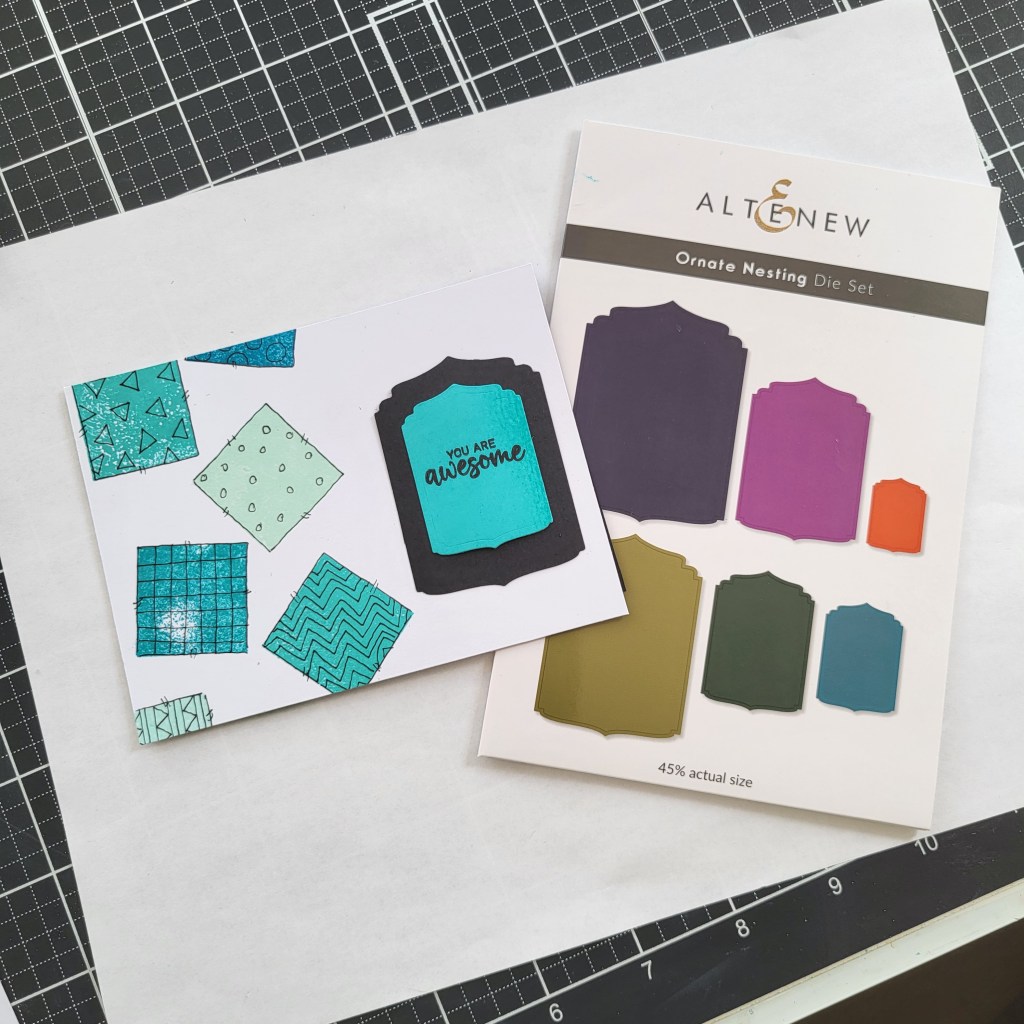
The sentiment was created using two sizes from the Ornate Nesting Die Set in black and the smaller one is actually a piece of white cardstock that I used the direct to paper technique (Irresistible Inking Techniques) with Aqualicious Fresh Dye ink to create. I didn’t have the right colour cardstock on hand, so I created some to match the card perfectly. I stamped the sentiment from the Summer Wishes stamp set and heat embossed with clear embossing powder. I again added some half pearls both for a little “bling” and to keep the theme consistent.

Card #4 used the square block again, but this time, only half at a time to create triangles along both sides of the card in alternating colours.
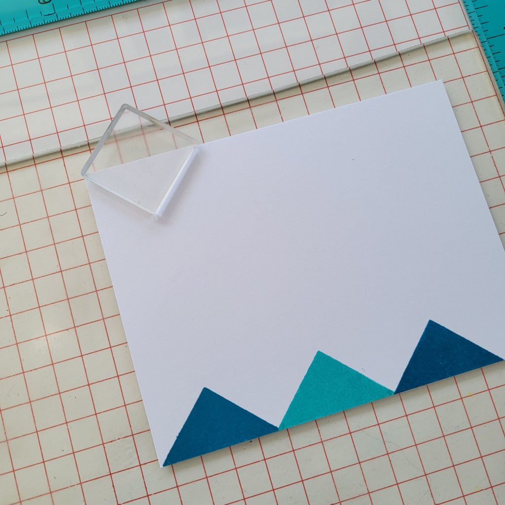

The stamping platform came out again to ensure I had everything lined up correctly.
(Tip – I use a sticky mat in my stamp platform to keep everything in place. I never had much luck with magnets as they always seemed to be in the way)
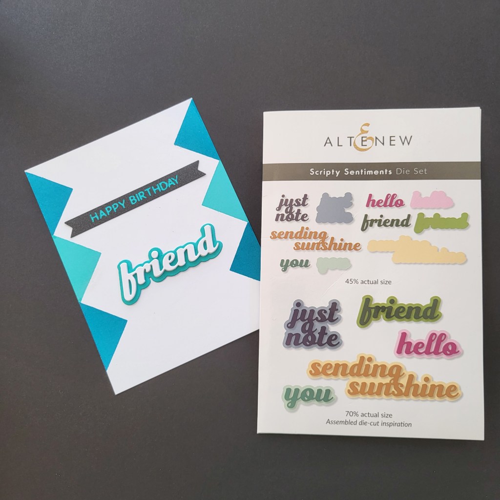
I chose two sentiments for this card. One is a glimmered sentiment (Happy Birthday) and the other is “Friend” from Scripty Sentiments Die set. The “friend” was die cut 3 times on 110 lb white cardstock while the shadow was cut once from paper that I inked to match as above. The topper was then mounted on black cardstock and mounted on the card. The final touch was the half pearls.

(Tip: When using sequins, half pearls (any type of bling really) keep your groups to odd numbers, or if they are scattered, keep the total number an odd number. When you use an even number, it looks off.)
Card #5 is a bonus card. I found an old pad of paper I had bought many years ago but never used. It was all specialty papers in various shades of Teal and they were a perfect match! This card utilized the printed acetate which just happened to have geometric shapes as it’s pattern.
There are no process pics for this one as it’s pretty simple. Black and teal frames with the acetate glued to the back of them and then glued to the card base. The sentiment is from the Timeless Sentiments set and was die cut 3 times out of 110 lb black cardstock and the shadow was cut from the same teal cardstock as the frame. This is the only one that did not have any pearls as they didn’t suit it.

Feminine Cards
On to the feminine cards. Again, there are 5 but I consider one as a “bonus card”. I’ll explain why later.
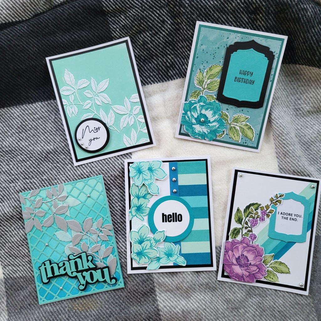
As you can see, I stuck with the same colour palette for the feminine set, and while there are some geometric elements, not all the cards have that component.
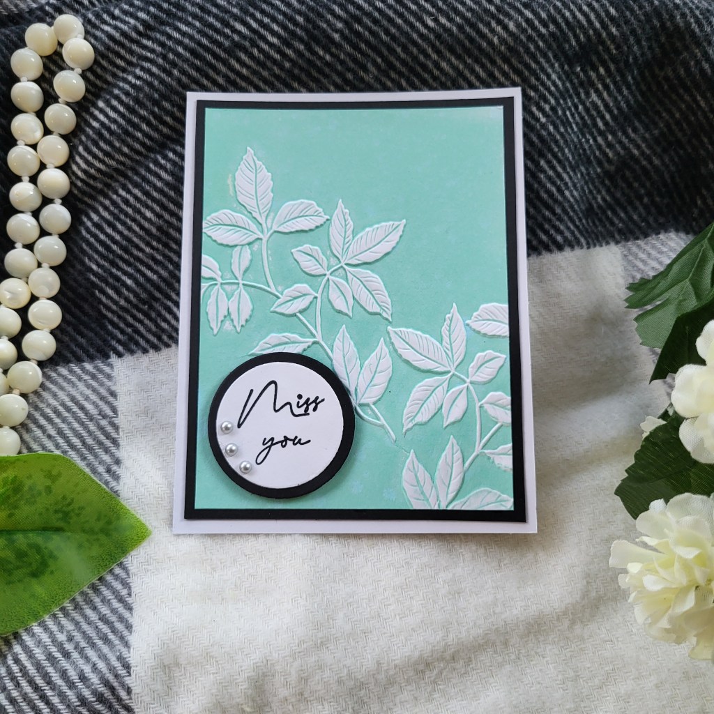
The first card is a CAS (Clean and Simple) card using the Leafy Splendor embossing folder. To create this card, I taped the panel into the embossing folder on the side with the printed title of the folder. I then inked the opposite side with Easy Breezy and ran it through the machine. I had to ink and run through about 4 times to get a smooth colour. Don’t get discouraged if it looks splotchy at first, just re-ink and run it through your machine until you get the coverage you are looking for. I used my Hero Arts Nesting Circles die set for the sentiment. Again, I wanted to get that little bit of black in there. I heat embossed the Miss You from the Elegant Sayings stamp set with clear embossing powder and finished it all off with the half pearls. The panel was cut to 3.75 x 5 and mounted on a piece of black cardstock that measures 4 x 5.25 and all was mounted on an A2 card base.
It’s ok to try new things and have them not work out. How would you know if you never tried? I had several fails on this technique while I was working on this card.

The panel on the left was my attempt using Hexagon Blocks embossing folder. It was a fail for the purpose intended but I will keep it and use pieces of it in another project. The center panel was an attempt using Distress Oxide Cracked Pistachio. I was hoping I could get better coverage using the Distress Oxide but it just ended up looking messy. The third panel was using the Rows of Squares embossing folder and I just could not get the ink into the squares on the far left no matter how many runs through the machine. Again, I will use it somewhere else on a mixed media project or something. Experimenting with new techniques or ideas will likely leave you with some pieces that you aren’t happy with, but if you are anything like me, you’ll find some way to use it down the road.
Feminine Card #2 was created using an ink blended panel. I used the Garden Trellis cover plate with some light teal cardstock and placed that over the panel. To give more of a “silver” accent than just the half pearls, I cut out several sets of leaves from the Fresh Flowers Die Set in brushed silver cardstock and a couple more in vellum.


Many of the classes talk about using depth in a card and this card has a lot of depth. I embossed the silver leaves using the Leafy Splendor embossing folder and layered them over the vellum leaves.
For the sentiment, I cut out 3 of the “Thank You” in teal cardstock, glued them together and mounted on a black shadow. I added just a few pearls.

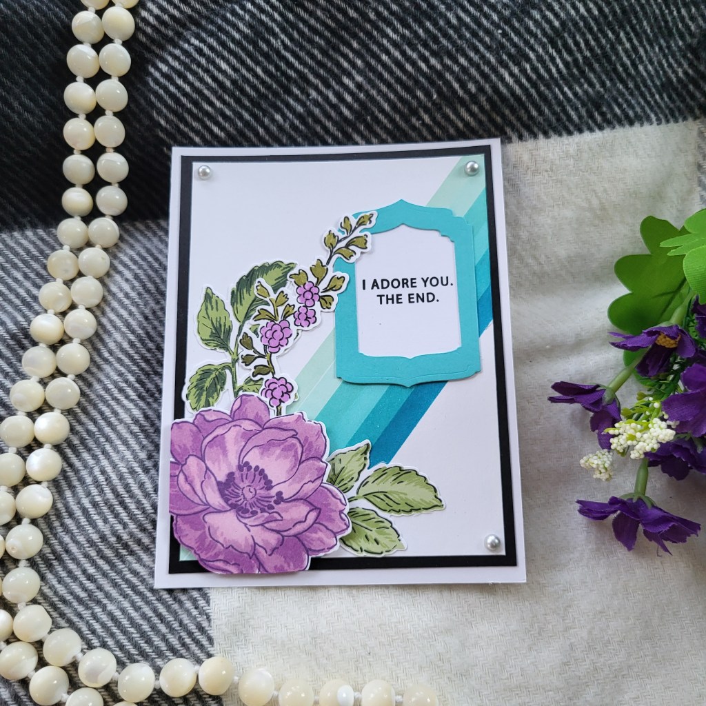
Card #3 utilized a couple of techniques from the Clean and Simple Boutique Cards class. One of the classes talked about using Metallics or Foils to enhance your cards and another class talked about luxury papers. Remember in the Masculine Cards section when I mentioned the paper pad I had found?

This card used one of those papers. It’s a teal background with patches of teal foil throughout it. There was also some teal mirror card sheets so I cut the original panel to 3.75 x 5 and mounted it on the teal mirror card (4 x 5.25).

I used the Beautiful Day stamp and die set in the same colour palette to create the flower design and used the Ornate Nesting dies for the sentiment block. The sentiment itself is from a Lawn Fawn set called Henry’s Build a Sentiment: Spring. The flower is popped up with foam tape, as is the sentiment.
Card #4 hearkens back to card #1 in the masculine set. I really liked the “piano key” look, so I recreated it for this card.


The flower cluster is Wild Geranium stamp and die sets. I did the base colour of one set of flowers in Dew Drop and the other one in Berry Cool. The black line on the side of the “piano keys” looked too stark for this card so I opted for some washi tape from The “Sweet Dreams” washi tape set but it was far too wide. Instead, I took a scrap piece of white cardstock, applied the washi tape and then cut a small strip out of that to create my border stripe.
I popped up some of the flowers with foam tape (2 mm) and also popped up the sentiment with a very thin (1 mm) foam tape. The sentiment is also from the Wild Geranium stamp set and was heat embossed with clear embossing powder. The panel was again mounted on black cardstock and then mounted on a white A2 card. Once it was all mounted, I added the 3 half pearl accents.
The bonus card! Card #5. I thought I would use diagonal stripes on this card and used masking tape to create my 1/4″ spaces which I then blended with my mini ink blending brushes.

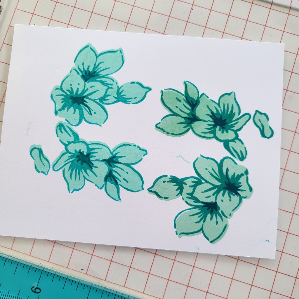
Once I had the stripes I wanted, I used my Beautiful Day stamp and Die set to create the flowers and leaves. I used some pink/purple inks from Versafine Clair for the flowers and used Frayed Leaf, Forest Glade and Evergreen (Altenew Fresh Ink) for the leaves. The sentiment uses the Ornate Nesting Dies again, in Teal and White. The sentiment itself is from the Leaf Clusters stamp set. The panel is mounted on black cardstock and then mounted on a white A2 card blank. The pearls were added to only the 3 corners as the bottom left corner didn’t really have room for one.
The reason I consider this a “bonus” card is that once it was completed, it didn’t seem to have the same feel as the rest of the set. I guess it was the flower colour being so different that made it stand out.
Packaging
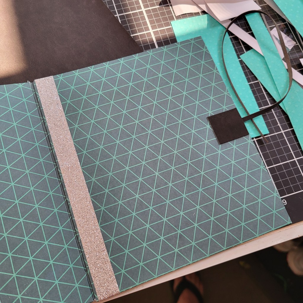
Now it was time to package it all up. I had many ideas pop into my head, from boxes to belly bands but nothing seemed quite right. I have been making some mini albums over the last couple of months and had an “Aha!” moment. What if I created a mini album with a pocket to hold the cards?
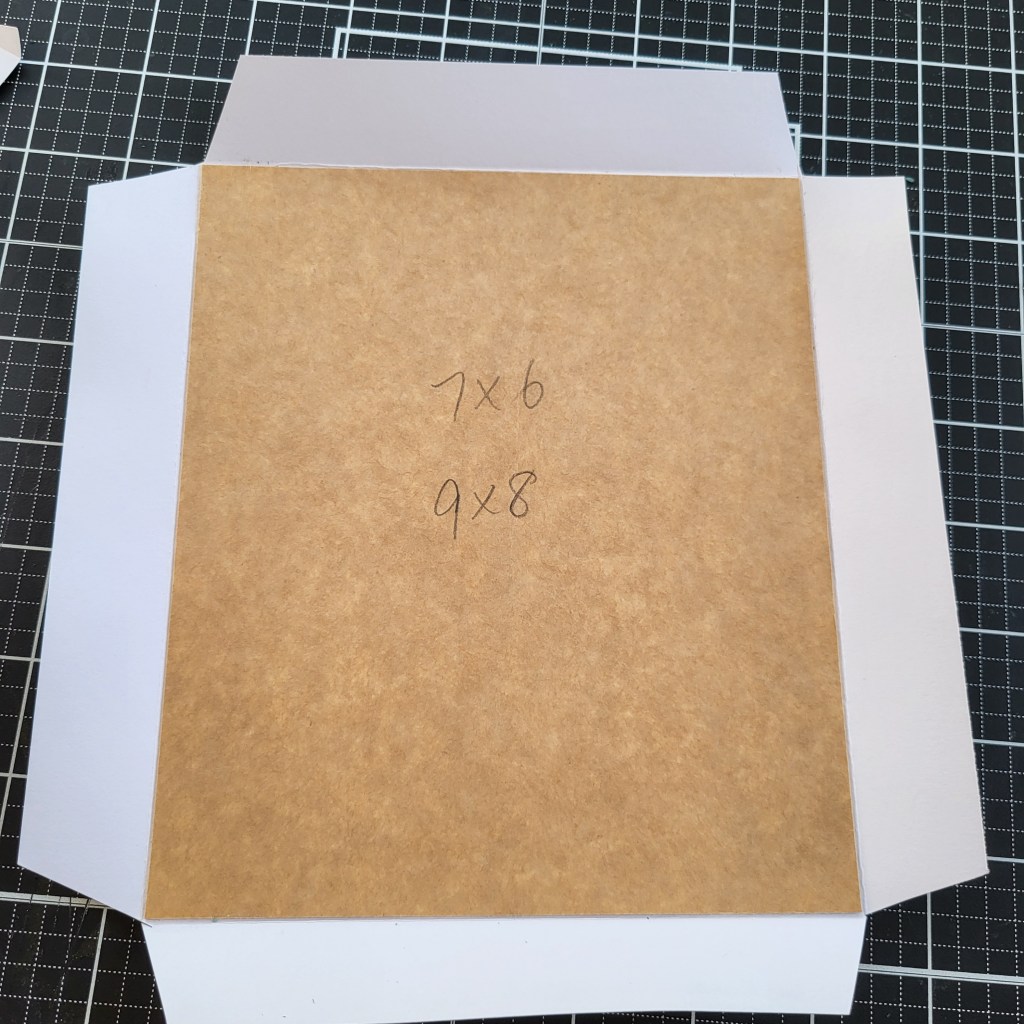
I had a couple of old cereal boxes and decided that was the best way to incorporate the recycled aspect into this challenge.
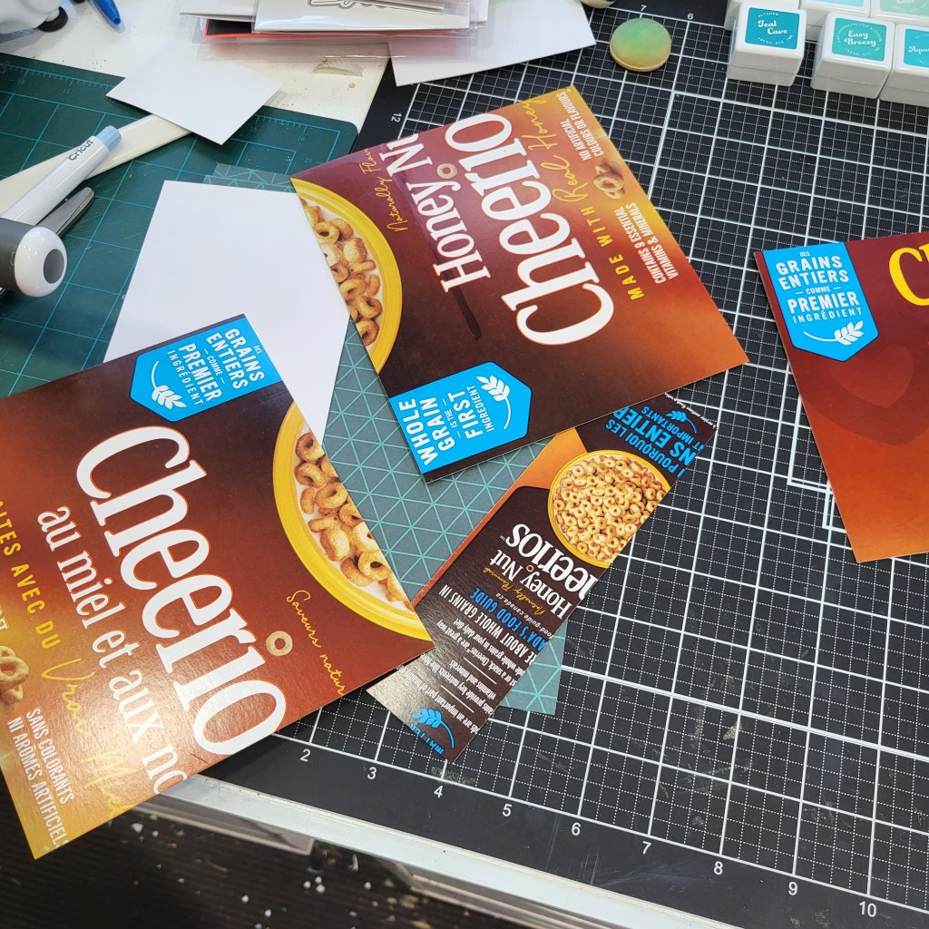
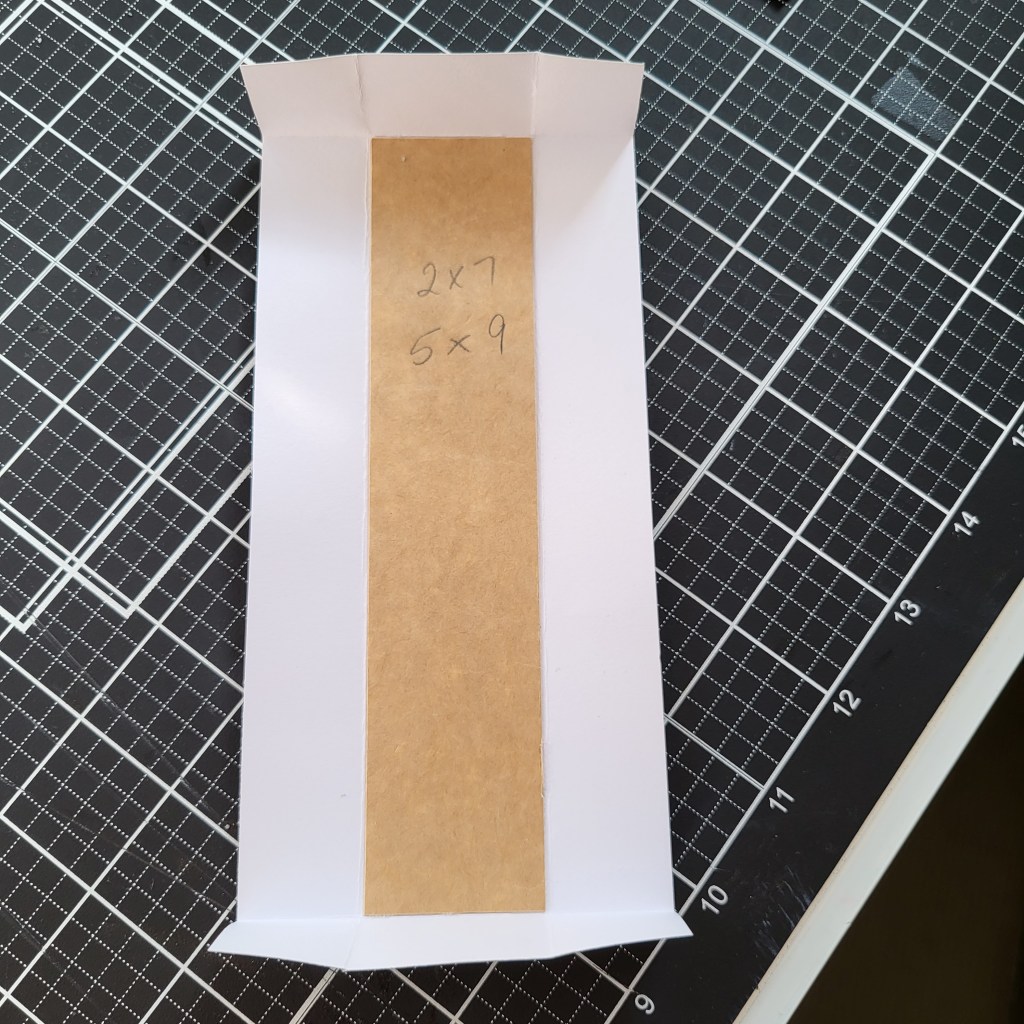
Back to the old paper pad. There was a really nice geometric patterned paper in there that I used for the masculine packaging.

I created a lay flat album, and used some faux leather I had kicking around to create the ties and the patch where the tie was glued on. I made a pocket to put the cards in out of cardstock and glued that into place inside the album. Once the cards are used, the album could be used to hold any number of other things, including photos. Because the opening of the pocket faces towards the spine, the cards can’t slip out.

Here’s the feminine version. Assembly is exactly the same, but I used different papers.


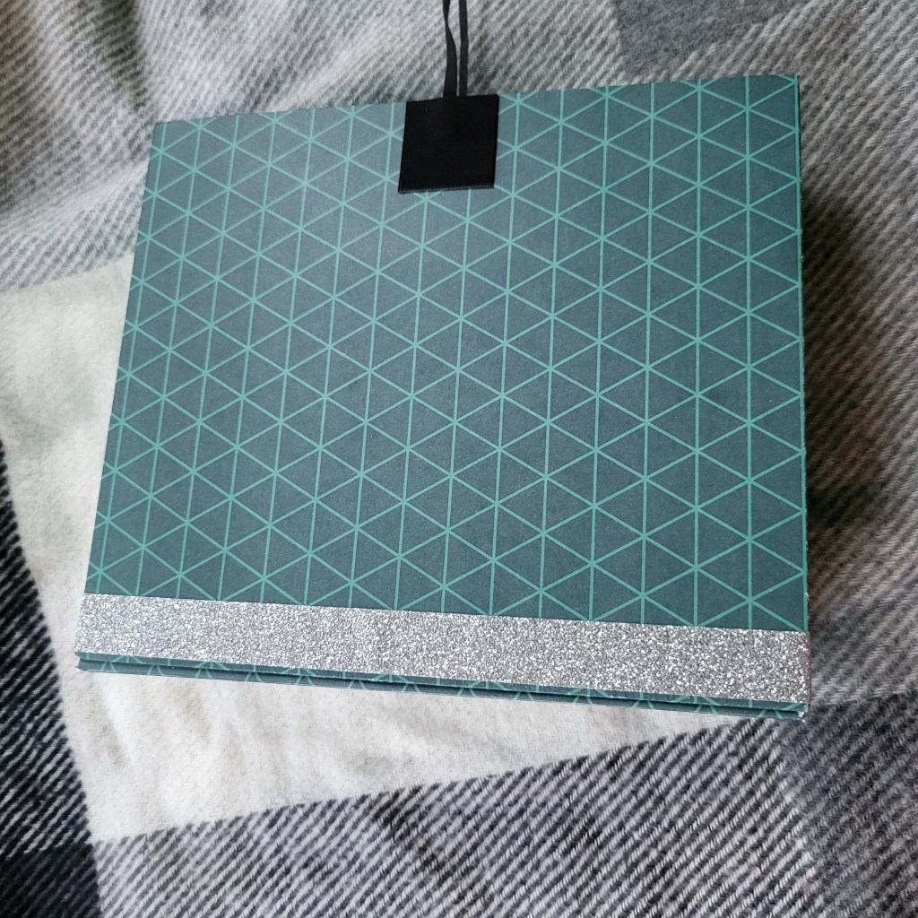
Here are the two completed albums.
All in all, I feel this challenge was a success and I am looking forward to level 2.
Please leave me a message if there is anything else you would like to know about the process or the products used.
Thanks, and I’ll see you soon!

Leave a comment